What Does the Pantone Colour of the Year Mean?
The Pantone colour system is an international language for colour; it is a means of standardising colours as a trendsetting concept. It does affect all industries where colour plays a major role, from fashion, interiors, cosmetics, and packaging, to graphic design.
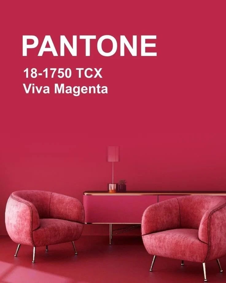
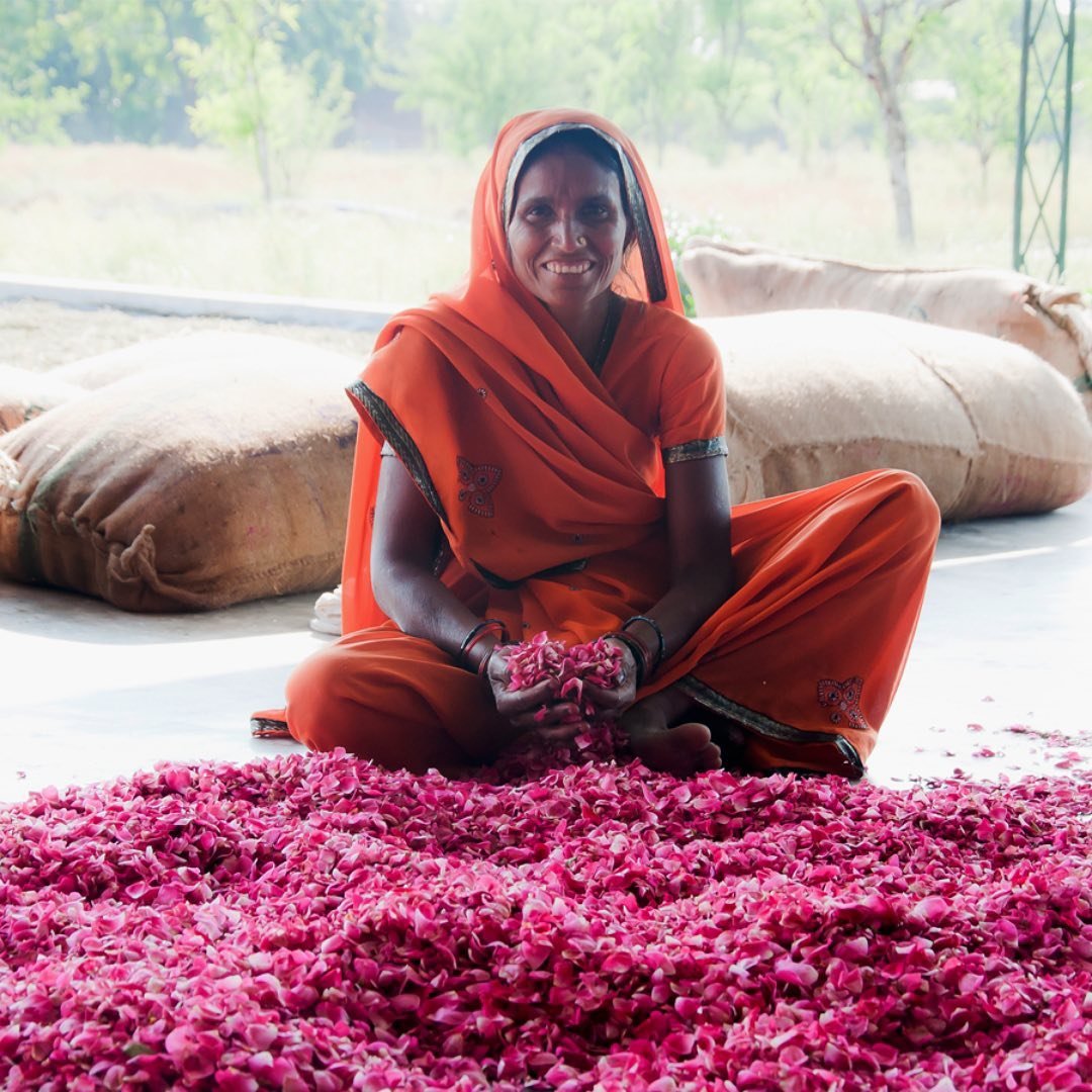
The Pantone colour of the year is selected to reflect the mood of the time; and with so many ‘unknowns’ in the world today, we are drawn to nature for inspiration and sustenance. Our current lifestyle trends are linked to nature; and Pantone’s Colour for 2023, Viva Magenta, is inspired by a natural dye.
Designers will work with the Pantone colour in fabric design, rug design etc., so that it will ultimately appear in throws, cushions, and furniture.
I personally don’t follow colour trends nor recommend them as I like to design with a timeless appeal; however, if a client wanted a pop of colour, then I would inject that through accessories and soft furnishings.
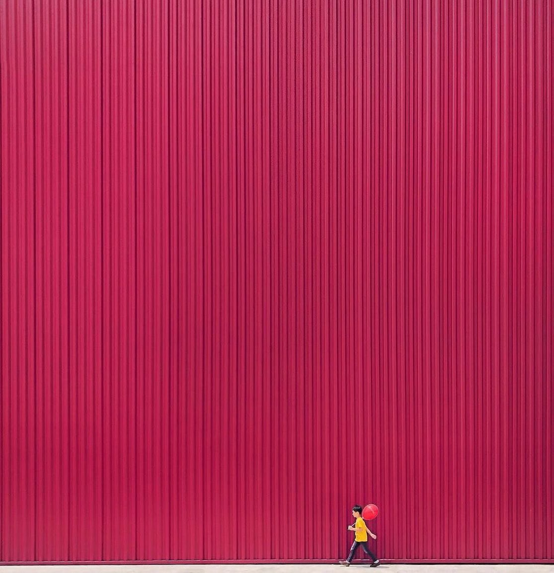
Red has played a role in interior design over the past 22 years as it’s a versatile colour; easily reflecting the world in which we move: from earthy and spice tones, to jewel-like tones. You can have warm reds and cool reds; and for 2023’s Viva Magenta, this is a hybrid red - marrying well with warm and cool colours. This means it’s easy to decorate with.
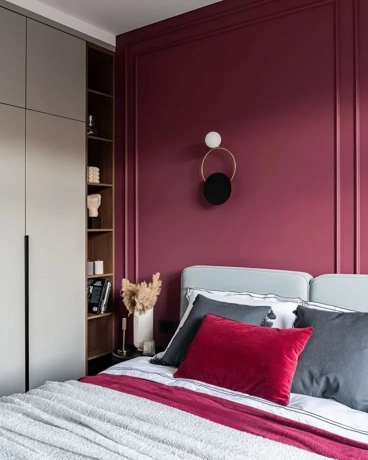
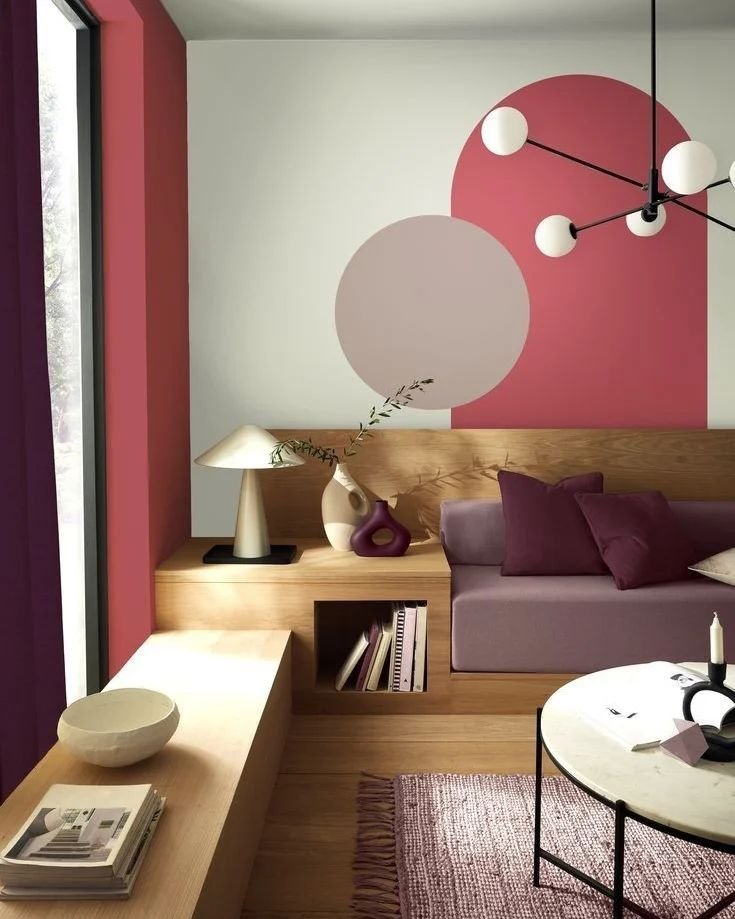
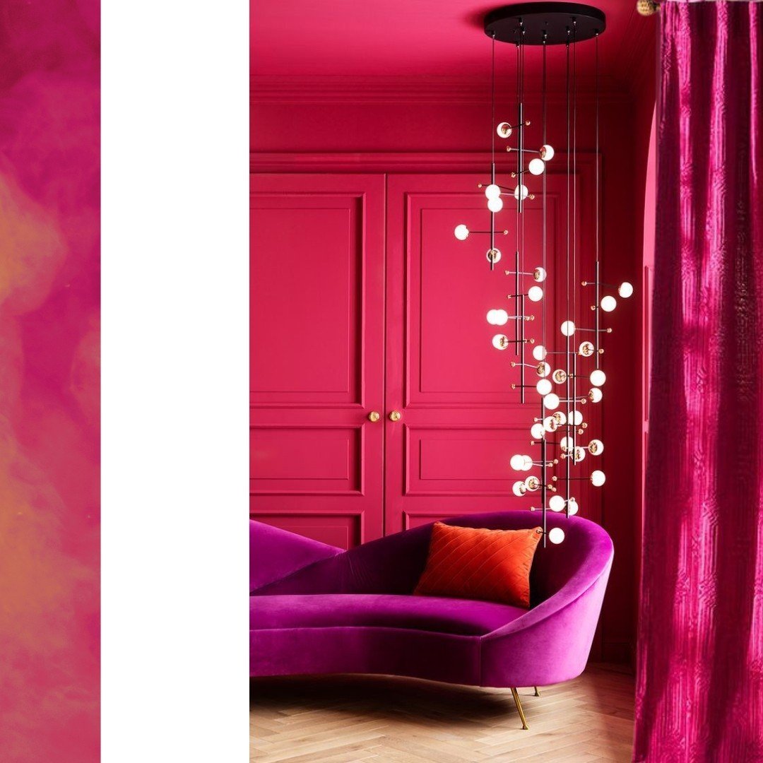
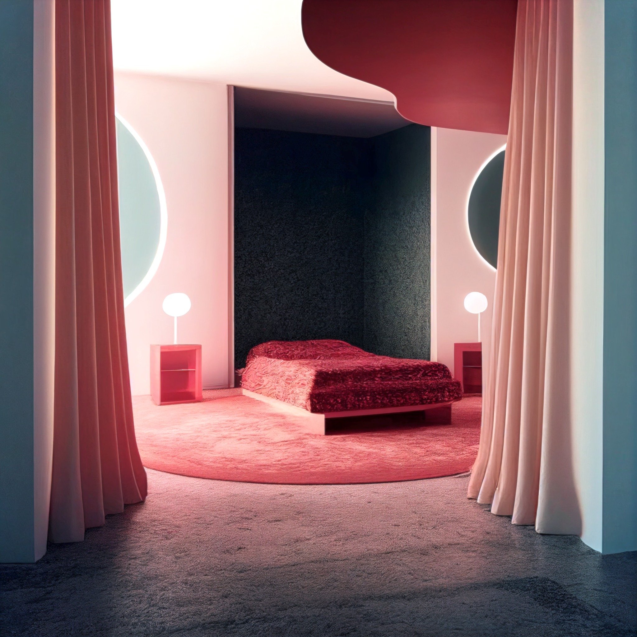
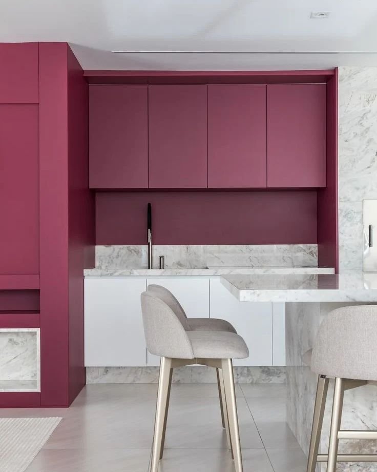
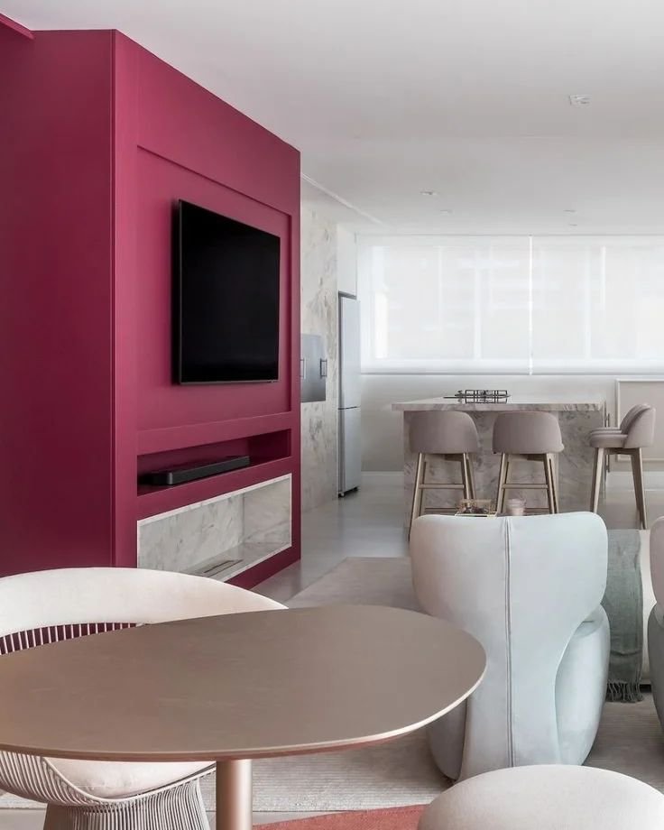
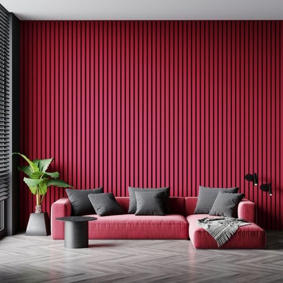
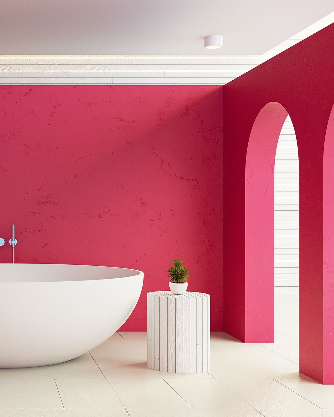
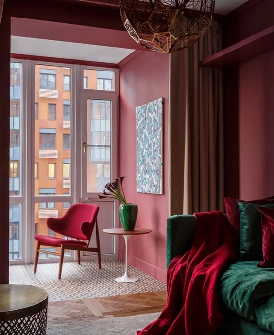
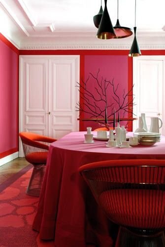
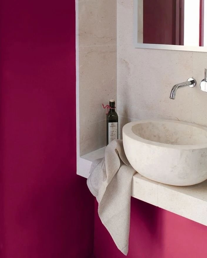
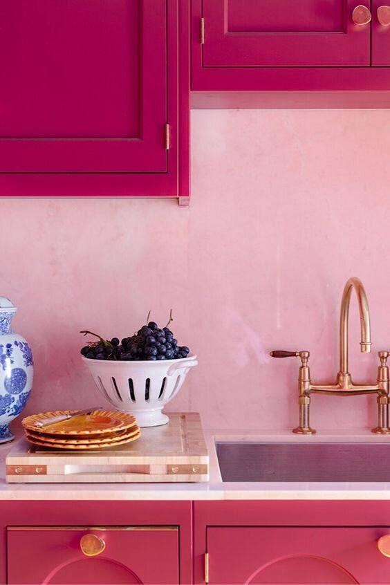
Viva Magenta certainly does have a place in residential design. It makes a statement; it is strong and self-assured but not overbearing; it’s inclusive, is fun, has depth, and looks luxe.
How to Use Viva Magenta
For the confident who want to make a statement…
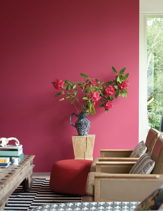
Finish in paint and/or wallpaper:
A front door in a high gloss
A lacquered finish
A corridor’s walls or entrance hall
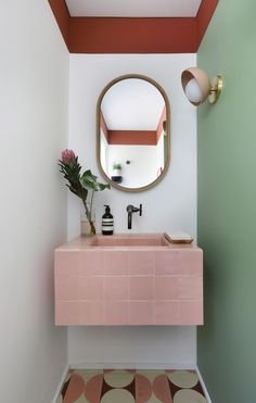
Dining room or powder room ceiling
Dining room or powder room Magenta floral wallpaper, Magenta and emerald green stripe wallpaper
As accents:
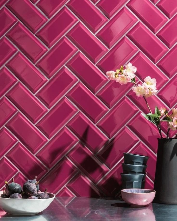
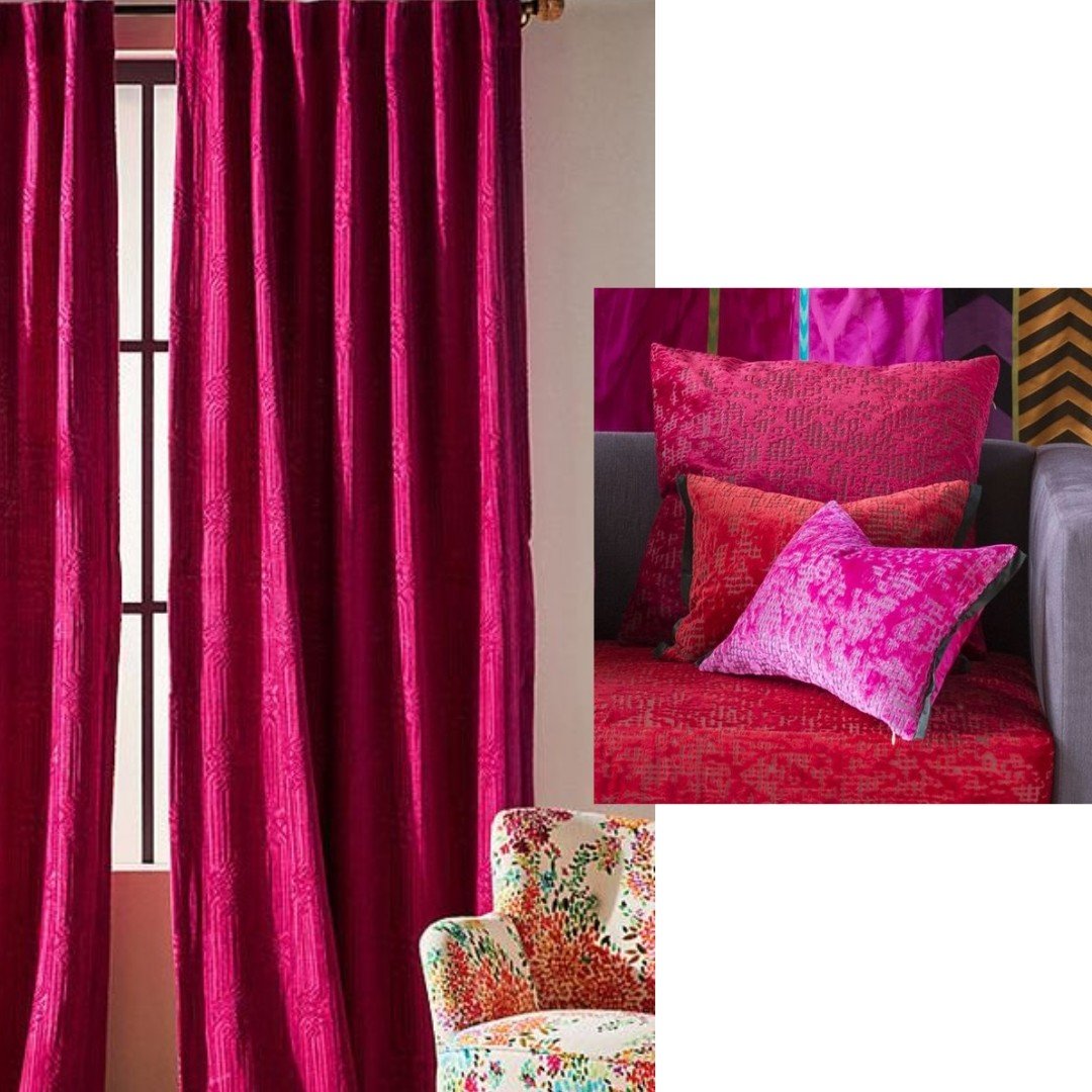
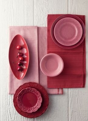
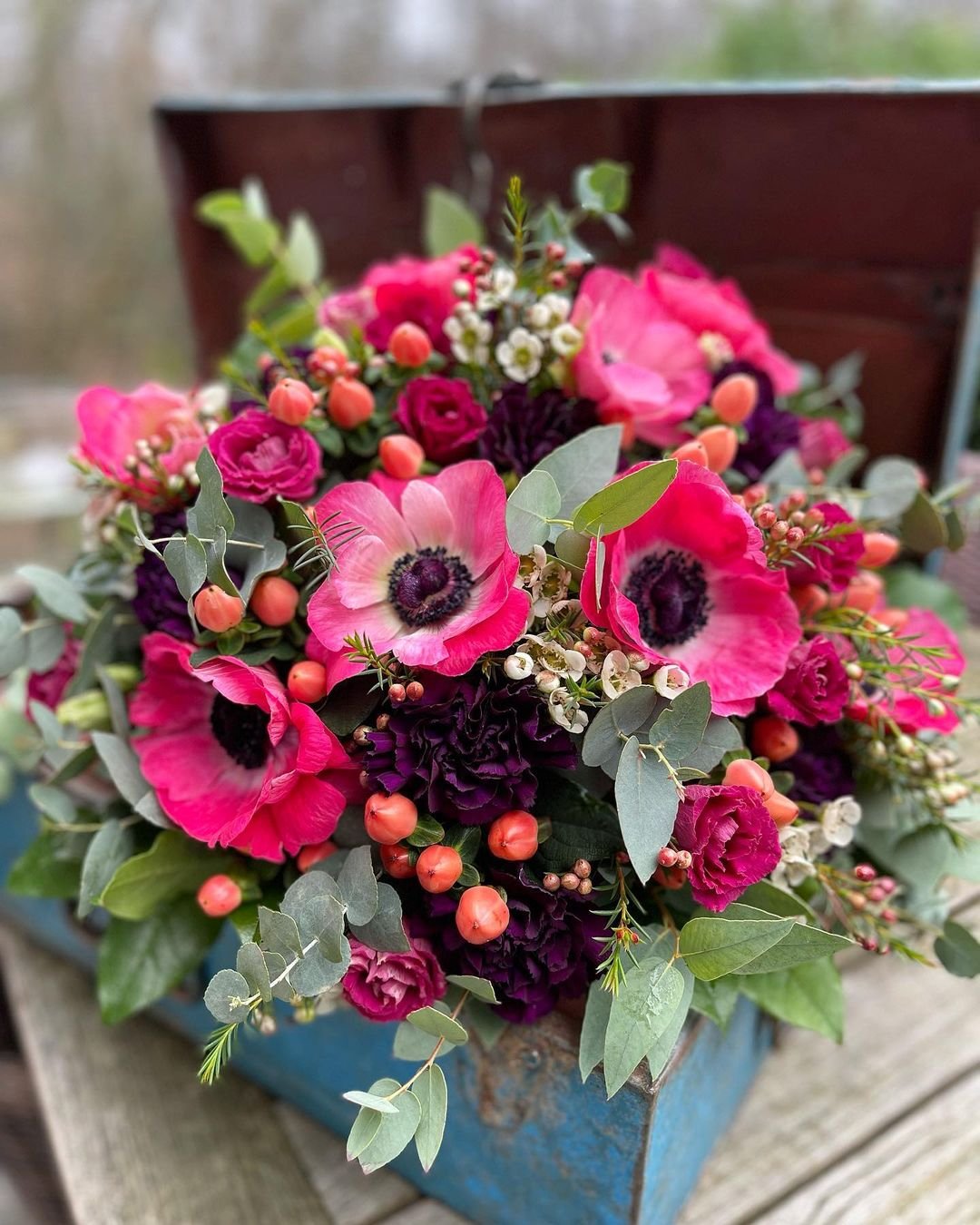
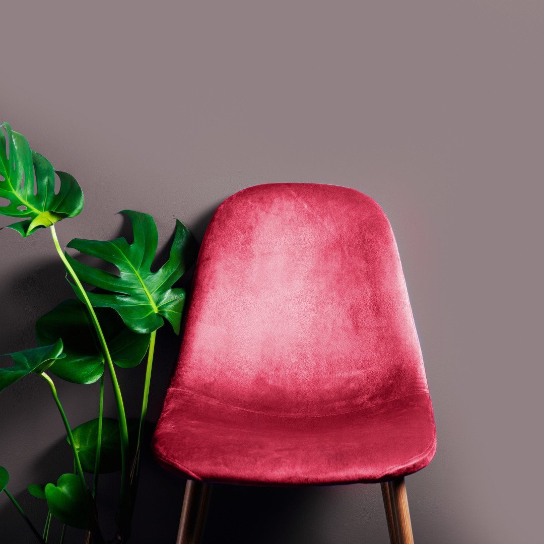
In a throw, rug design, velvet curtains, lampshades, accessories, napery, crockery, ceramics, glassware, upholstery, cushions.
Pairs well with midnight blues; emerald greens; dark, cool charcoals; and bright, vivid whites…
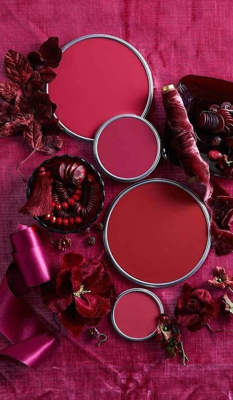
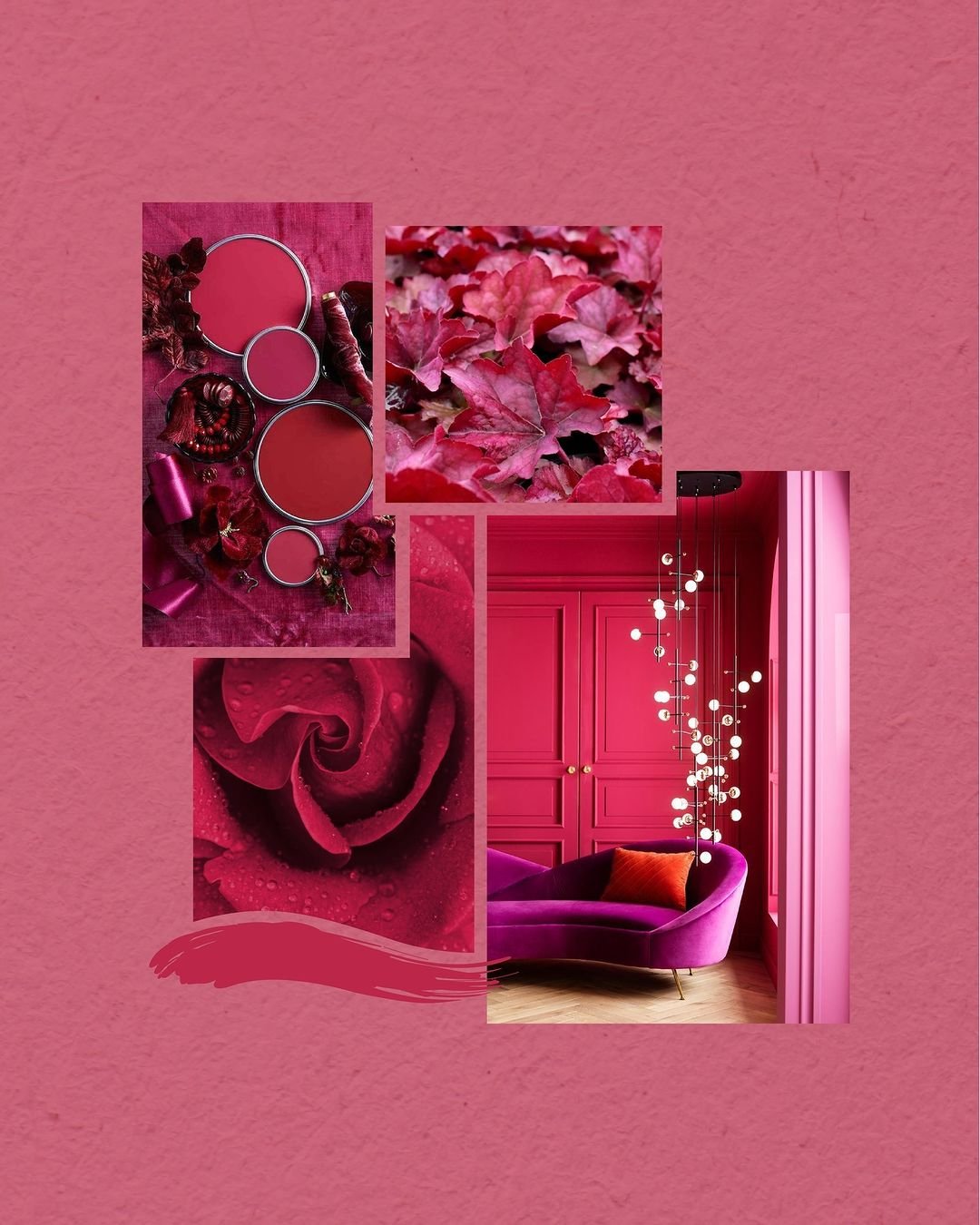
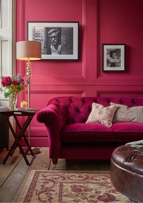
“This red is sophisticated, versatile, adds a sense of luxe, and exudes confidence and individuality. It is a balanced red that will bring balance and optimism into your home.”
For more Viva Magenta inspiration, head to IDI’s Pinterest board.


